What’s On/Operations
Brand guidelines your suppliers will actually use
A brand book proves its worth on an ordinary weekday, when a printer or a developer needs the right logo in a hurry. Here is what it should hold, and how to keep it current.
Picture the day a new landing page goes live. The logo is a little stretched, and the green is not quite the brand green. Nobody set out to get it wrong. The developer either never saw the brand guidelines or found them and could not pull a usable file out of them. When guidelines fail, the design of the document is rarely to blame. What goes wrong is the content, the way it reaches people and whether anyone keeps it current.
The real test of a brand book is a routine weekday request, not the handover presentation.
Who you are really writing for
The marketing director who signed off the identity will seldom open the guidelines again. The people who will are further from the brand: an in-house designer making a flyer, a freelance developer on a landing page, a signage printer preparing a quote, an influencer agency adding your logo to a story, a marketing hire who arrived after the rebrand. Every one of them comes with one question and expects an answer inside a minute. Keep the pages on brand essence if you like, just not in front of the logo downloads.
What the book should contain
- All the logo versions in use: primary, secondary or stacked, the standalone mark, plus single-colour versions for light and for dark backgrounds.
- Minimum size and clear space, illustrated on the logo instead of described in words.
- A brief list of misuses to avoid: stretching, recolouring, effects, or setting the logo on top of busy photographs.
- The palette, with each code any supplier might request.
- The typefaces, what each is used for, the weights, and where they can be obtained.
- Guidance on photography and illustration, using genuine examples of what works and what does not.
- Ready-made templates for the items you produce most, typically social posts, presentations and email signatures.
- If the brand works in Arabic and English, the Arabic side too: the Arabic logo lock-up, the Arabic typeface and how the two are paired.
A tone of voice section belongs here as well if the brand has one, but make it concrete. A list of adjectives tells a writer very little. A couple of sample captions, one on-brand and one off, tells them far more.
Files, not pictures of files
Showing the logo inside a PDF does not give anyone something they can place in a design. Include the actual files, named plainly and organised by purpose rather than by format.
- SVG: for the web, and for anyone who has to resize the logo.
- Transparent-background PNG: for slides, documents and social media.
- A print vector, normally EPS or PDF, with any colour versions made specifically for print.
- A square crop of the mark: for profile pictures and app icons.
Build each file name from brand, version, colour and format, so someone who has never seen the brand can pick correctly. When a folder holds final, final2 and logo-new, it is only a matter of time before the wrong one is printed on a billboard.
Every colour, in every system
This is the section suppliers lean on most, and the one most likely to let them down, because a web developer, a video editor and a printer each work in a different colour system and each will ask for their own code.
- HEX: websites and digital design.
- RGB: screens, video and presentation software.
- CMYK: print.
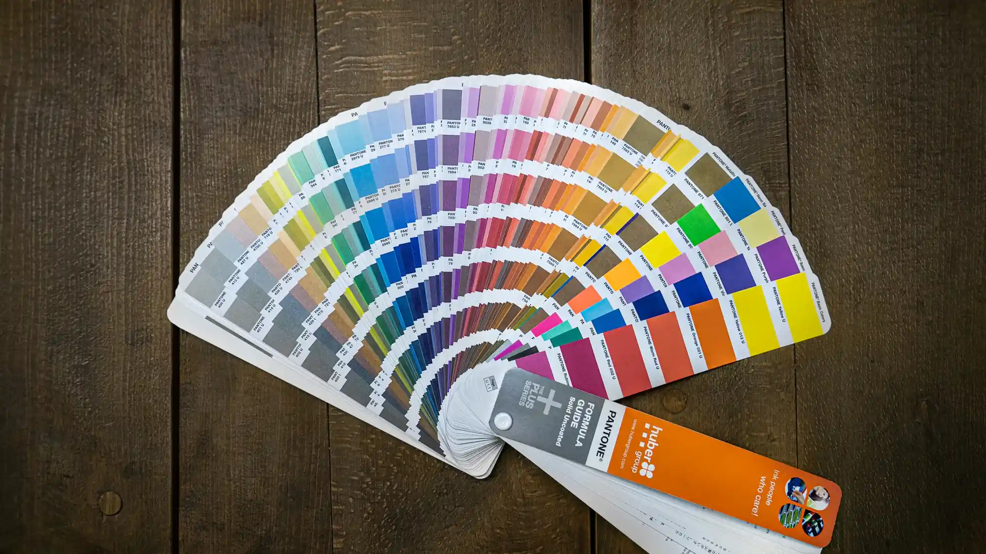
- Pantone, if the brand has specified one: print work that must match exactly.
Label each colour with the name your team uses day to day, so that an instruction like use the sand, not the cream, is understood by everyone. Converting between systems is not always exact, and screen to print is the usual trouble spot. If a printer has already matched a colour against a physical proof, write down the values they used and rely on those over any automatic conversion.
Fonts, and who is allowed to use them
A font named in the guidelines is not a font anyone may use. Commercial typefaces are often licensed by company, by number of users, or by type of use such as desktop, web or app. Your design team's licence might not extend to your freelancers, or to your website.
Spell it out: which fonts are free and where to download them, which are licensed and who holds each licence, and which fallback to use when the brand font is missing, for example in email or in a presentation opened on a borrowed laptop. If the brand depends on a font nobody has bought a licence for, raise it at handover. It is a small conversation then, and a much harder one once a supplier has been asked to stop using it.
Share a link, not an attachment
The day guidelines are emailed as a file, they start to fragment. There is the inbox copy, the shared-drive copy and the copy on a freelancer's laptop, and when a colour is tweaked, two of those three are silently out of date.
Hold one live version in a single location and point everyone to it with a link. Edit it there, date each change, and let the heaviest users know. Keep earlier versions if they are useful for reference, but label them clearly as superseded.
The measure of good guidelines is not how thick they are. It is how few clicks stand between a stranger and the right logo.
Access should be free of friction: no account to create, no permission to request before downloading. Every request that has to be routed through your marketing team or your agency is a request someone will eventually bypass by grabbing a logo from a search engine. A simple benchmark: a supplier who has never dealt with you should be able to find the right file unaided.
If your brand files are scattered across inboxes and old drives, or you are planning a new identity, talk to ALXO about guidelines designed around the people who will open them.