What’s On/Operations
Moodboards that win approval: how to build and judge one
A good moodboard makes a case you can agree or disagree with. A weak one is a wall of pictures you are asked to like. Whether you build them or sign them off, here is how to tell the difference.
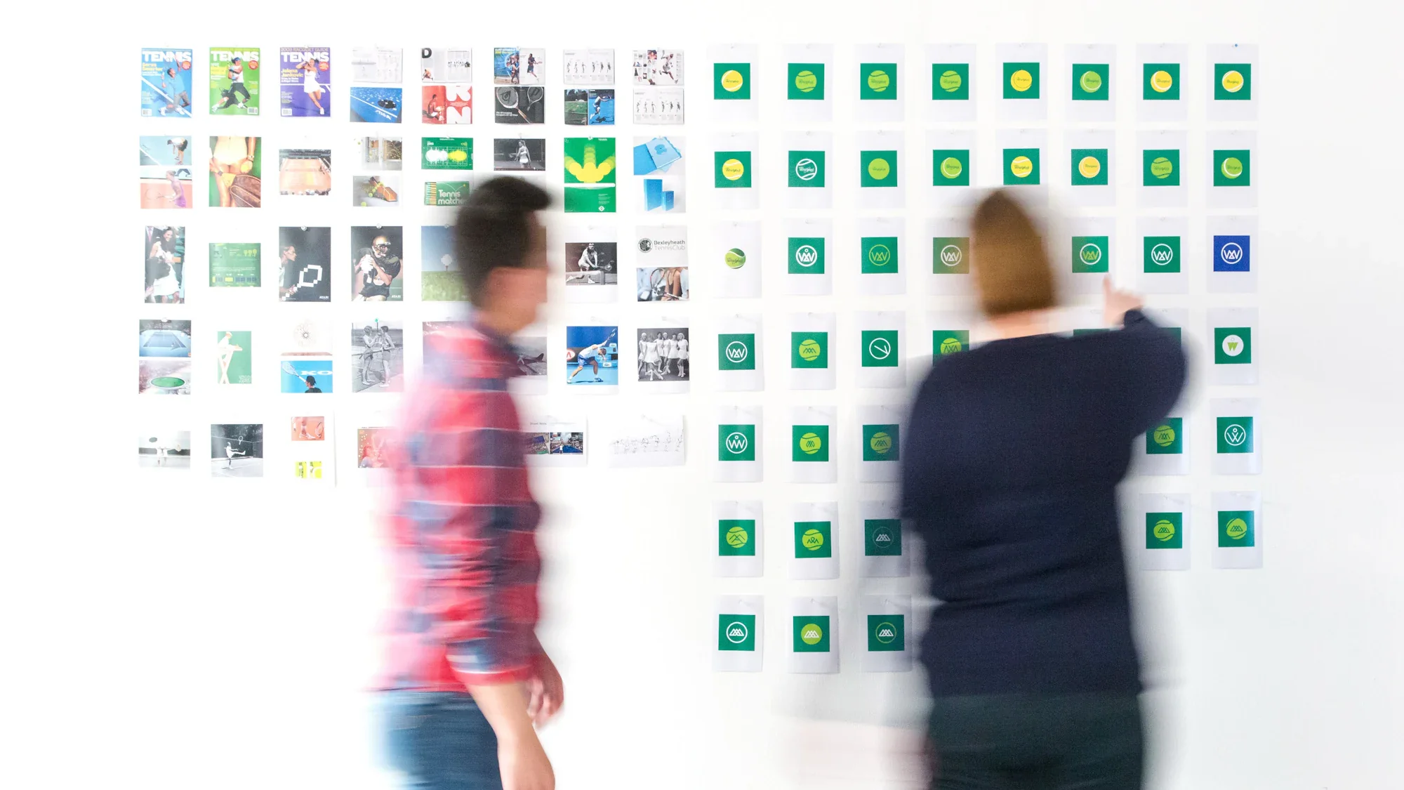
Most moodboards stall in the same way. Someone gathers forty striking images, lays them out nicely and sends them across. The reply says some of it is lovely, singles out three pictures that share nothing, and asks for a few more options. A week later a second board arrives, and nobody can remember what the first one settled.
The images are rarely the problem. The problem is that the board never said what it was proposing, so the person approving it could only react to pictures one at a time. Whether you are building a moodboard in-house or reviewing one from your agency, the fix is the same: treat it as a proposal, not a collection.
Begin with the questions it must answer
Before a single reference is collected, list the two or three decisions the board needs to settle. For a campaign that might be the feeling, the colour world and the style of photography. For a rebrand it could be tone, typography and how premium the brand should look. Take them from the brief, in the brief's own words wherever possible.
Those questions then become the board's structure, and every image should be there to answer one of them. Anything that does not is decoration, however attractive, and decoration is exactly what people end up commenting on.
Organise it in frames
A single grid leaves the viewer to find the pattern. A board divided into frames shows the pattern, and lets someone agree with one part while questioning another.
- An opening frame that restates the objective and the audience from the brief.
- One frame per question: mood, colour, photography, typography, texture or motion, whichever the project calls for.
- A handful of references in each frame, not dozens. Five well-chosen images make a point; twenty water it down.
- A closing frame that sums up the direction in one sentence and lists what will be made next.
Where there are two genuinely different routes, present them as two labelled directions, each with its own frames, rather than blending them. Choosing between two coherent routes is easy. Untangling one board that holds both is not.
Pick every reference for a reason
Each image should justify its place, and whoever made the board should be able to say in a few words why it is there: the light in this one, the crop in that one, the way this campaign commits to a single colour. An image kept only because it is beautiful usually draws the most attention and the least useful feedback.
Take care with references that carry a brand of their own. A picture from a well-known competitor, or from a campaign the decision-maker dislikes, can close the conversation before it begins. Crop in on the quality you mean, or find a less loaded example. In the Gulf, also check that the people, clothing and settings suit the audience and market the work is for, because a reference that would pass elsewhere can pull attention from the point.
References are not a promise either. The board should say plainly that it shows a direction and that the finished work will be original, so nobody expects a copy of a picture they liked.
Put the reasoning on the board
One or two sentences beside each frame do more for approval than any image. They say what to look at and why it answers the brief: warm, low evening light, for instance, because the brief asks for the product to feel like part of family time rather than a treat.
Notes also protect the board once it starts travelling. It will be forwarded to a colleague who missed the meeting, and without the rationale that colleague sees only pictures and responds to them on taste.
Without notes, a moodboard asks whether people like the pictures. With notes, it asks whether they agree with the thinking, and that is a far better question to hear yes to.
Walk through it before anyone reviews it alone
A moodboard should be presented, live or in a short recorded video if a meeting is not possible, before the decision-makers look at it on their own. Begin with the brief, move through the frames in order and finish on the summary. Taking it in sequence stops the discussion fixing on the one image that surprised someone.
Then ask for decisions rather than impressions. Not what do you think, but is this the right feeling, does this colour world fit, which of the two routes goes forward. Closed questions produce answers that can be acted on. If you are the one approving, replying in that form is the quickest way to get the work you want.
Keep feedback attached to what it means
Feedback only helps when it is linked to the part of the board it concerns. A note saying less dark, sent in a separate email, could mean the photography, the palette or the whole mood. The same note pinned to the colour frame is unmistakable.
Collect the comments, settle any contradictions with a single lead approver, and confirm the agreed direction in writing before production starts. Keep a copy of the board exactly as approved, so the finished work can be checked against it later. Whatever tool you use, the essentials are frames, comments pinned where they belong and a clearly named version of what was sent and signed off.
Brand identity and creative direction are part of what we do at ALXO. If you have a campaign or rebrand coming up and want the direction agreed early, we would be glad to hear about it.