Brand Identity
London, UKRosko Studios
- Client
- Rosko Studios
- What they do
- Merch for artists, labels and promoters
- What we did
- Logo, colour, type, posters
- Where
- London, UK
- Made with
- O-K Consulting
The Brief
What they asked forMerch people actually want to wear.
Rosko makes merch for artists, record labels and event promoters. Tour tees, hoodies, caps, the lot.
They came to us with a good name and a clear idea of who they were for. What they didn't have was a look. They wanted something loud enough for a gig poster and simple enough to stitch on a cap, with a bit of the Y2K stuff their crowd grew up with.
We started with the R. It had to work at the size of a woven label and the size of a billboard, so we kept it chunky, cut a single notch through it and built the wordmark from the same blocky shapes. Then we picked six colours that look good together in almost any pairing, so every drop can feel a bit different without anyone losing track of whose it is.
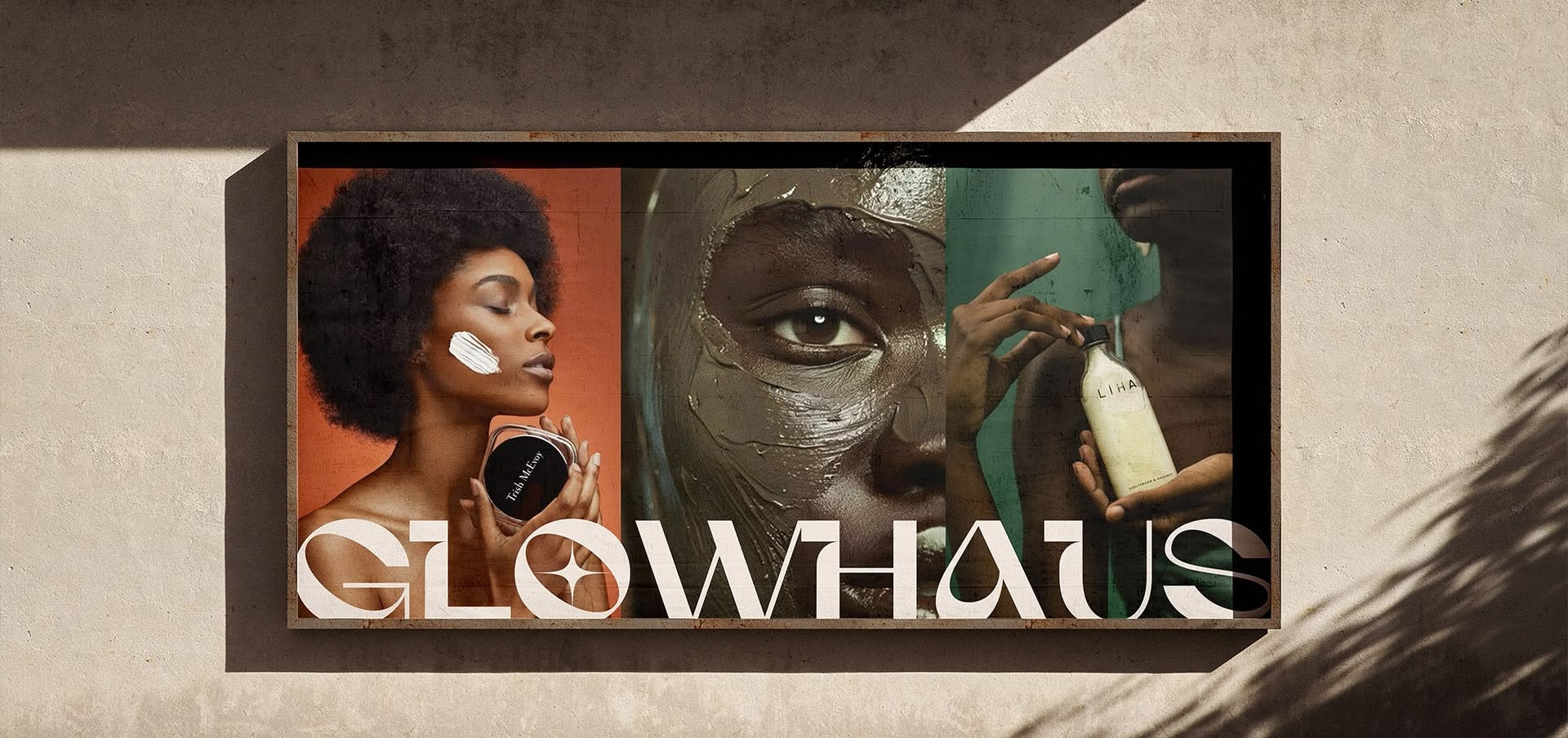
We worked on Rosko together with our friends at O-K Consulting, who we also teamed up with on Glowhaus.
- Logo and monogram12 lockups, 7 marks
- Colour palette6 colours
- Type system2 families
- Launch campaignBillboard and posters
- PartnerO-K Consulting
The Logo
19 versionsOne R, lots of outfits.
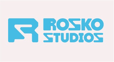
The full lockup goes on posters, swing tags and the website. The R on its own goes everywhere else: sleeves, caps, stickers, profile pictures. Every version uses colours from the same palette.
The Colours
Click one to copy itBlack and white do most of the work. The four brights take turns, usually two at a time.
The Type
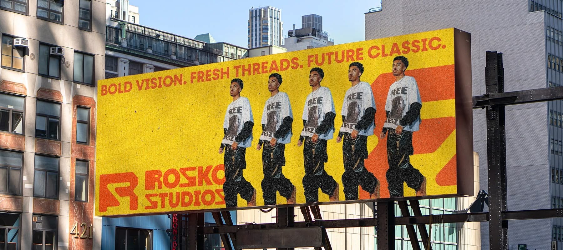
Two familiesHeadlines and the wordmark use Fractul, a chunky display face with squared-off curves. You can see it on the billboard at the top of this page. (The word above is a stand-in, since Fractul isn't a web font.)
Aa Bb Cc Dd Ee Ff Gg Hh Ii Jj Kk Ll Mm Nn Oo Pp Qq Rr Ss Tt Uu Vv Ww Xx Yy Zz 0123456789
Rilley and Helvetica come in now and then as accents, but these two do most of the work.
Out in the World
Launch posters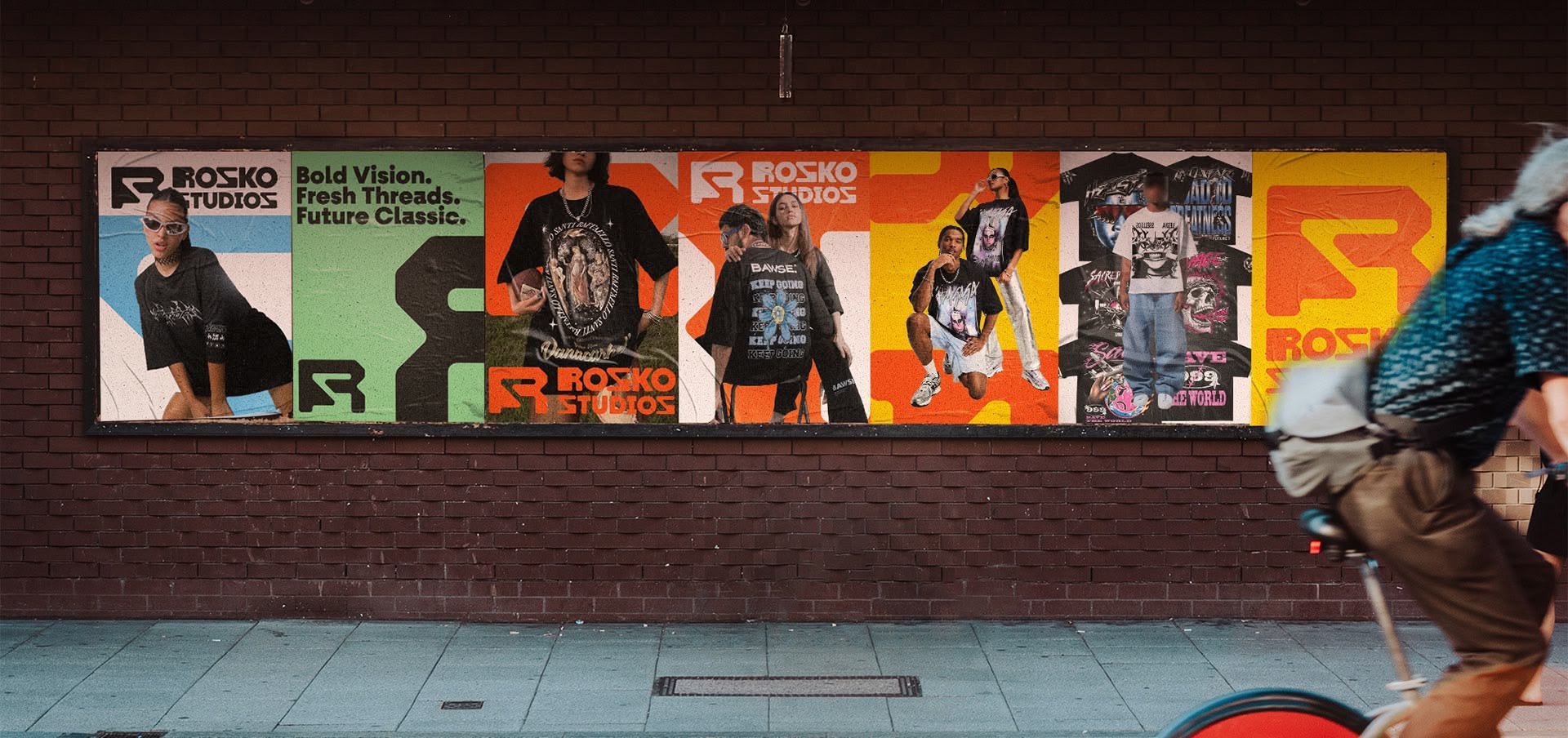
Glowhaus
Say Hello
Reply within 24hNeed a brand like this?
Tell us a bit about what you're making. A real person will get back to you within a day.